writing
Common UX Case Study Mistakes That Make Strong Work Look Weak
Avoid common UX case study mistakes that hide strong design work, from unclear roles to overclaiming impact.

By Ömer Arı
3 min read
The real problem
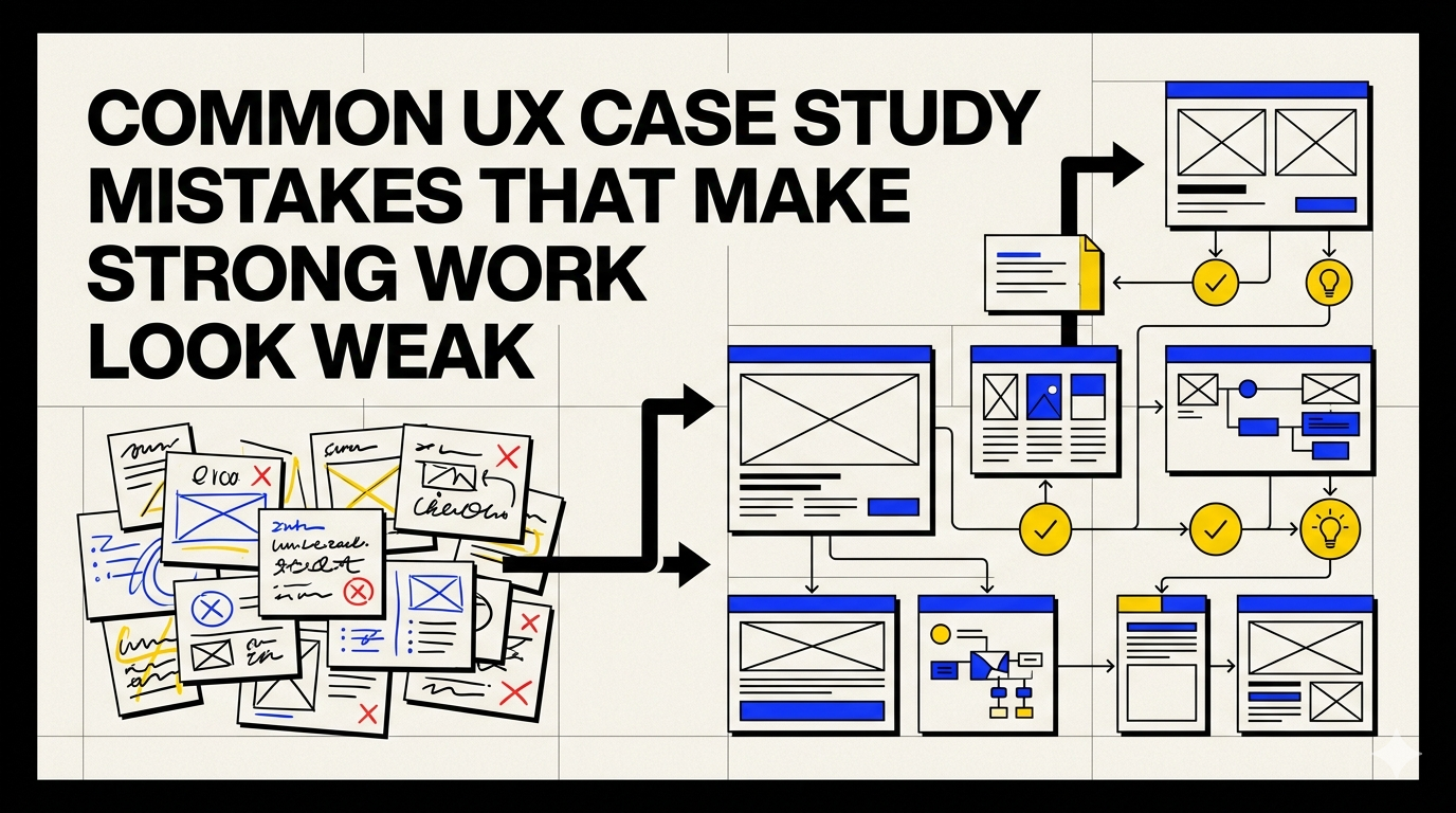
A weak case study does not always mean weak work. Often, the work is solid but the story is hard to follow. The most common mistakes happen when designers show outputs without context, describe process without decisions, or claim impact without evidence.
This is where many portfolio pages lose strength. They show activity, but not reasoning. They show artifacts, but not the thinking behind them. For a hiring team, mentor, or reviewer, that missing reasoning can make even good work feel hard to evaluate.
What to focus on instead
A stronger case study does not need to sound dramatic. It needs to make the work easier to understand. The reader should be able to see what problem you worked on, what your role was, what choices you made, why those choices made sense, and what changed because of the work.
Key principles:
- Too many screens, not enough context.
- Unclear personal contribution.
- Process listed as steps instead of reasoning.
- No trade-offs or constraints.
- Outcome section that is either missing or exaggerated.
A practical structure
Use this simple flow:
- Context: What was the product, team, or situation?
- Problem: What needed to change or become clearer?
- Role: What were you responsible for?
- Decision: What important choices did you make?
- Reasoning: What evidence, constraint, or trade-off shaped those choices?
- Outcome: What changed, what was learned, or what became easier?
This structure keeps the case study readable without turning it into a shallow template. The goal is not to fill sections. The goal is to help someone understand your thinking.
Example framing
Weak framing:
I redesigned the flow and improved the user experience.
Stronger framing:
I focused on the onboarding step where users were unsure what to do next. Instead of adding more explanation, I simplified the sequence and made the next action more visible. This helped the team align around a clearer first-use experience.
The stronger version does not depend on exaggerated claims. It explains the situation, the decision, and the reasoning.
What to avoid
- Do not turn the case study into a gallery of screens.
- Do not hide your role behind vague “we” language.
- Do not overclaim impact if you do not have evidence.
- Do not describe every step equally; highlight the decisions that mattered.
- Do not copy another designer’s case study structure without adapting it to your own project.
Final thought
A strong UX case study is not just proof that you worked on a product. It is proof that you can think through a problem and explain your choices clearly.
More case study guides
Related reading
Mar 26, 2026
3 min read
How to Start a UX Case Study When You Feel Stuck
A practical way to begin your UX case study when the blank page feels too big and you do not know what to write first.
Apr 23, 2026
3 min read
How to Turn a Simple UX Project Into a Strong Case Study
Simple UX projects can still reveal strong design thinking. Learn how to find the story inside a smaller project.
Apr 7, 2026
2 min read
How to Write UX Case Study Titles That Get Attention
Learn how to write clear and specific UX case study titles that communicate problem, context, and impact without sounding generic.